Landscape Photography Tutorial (Black & White)
Hey folks. Today I’m going to speak just a bit on landscape photography; however, the focus will be specifically on black and white (monochrome) and how it differs from color landscape photography. If you have not already read my Landscape “Basics” tutorial you may want to start there for information on equipment and basic techniques.
What are you looking for in a black and white landscape?
Well, first things first. You need to start learning to view the world in an unnatural way (ie: without color). This is not so easy since we are hard wired not only to see color, but to react to it in many emotional ways. We are often drawn to specific colors more than others (this directs the eye and focus). We also assign emotional values to different colors (eg: blue/calming, red/strong/angry, etc).
Without this color information we must learn to draw the eye within the photograph only with composition and tone. Tones will be our true differentiator from color photography since composition is important in any photograph.
Tones are how any given color sits on a scale of black to white. While no tone has a color, all colors have a tone. Think of it in this way. Within a black and white photograph each color is now represented by some scale of grey (black, dark, mid, light, white). While in a color photograph it is easy to see the difference between a dark green and red object. In black and white those two may have very similar tones and thus a green and red object may not separate hardly at all. I use the term “may” because various shades of green/red will have different tones. When viewing a black and white image, a very light green (lime) will stand out easily against a dark red (burgundy) while the mid-tone green of a leaf may not differ much from a mid-tone red of a cardinal sitting within those leaves.
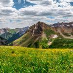
Because some different colors can have similar tones your landscape will benefit greatly if you can find scenes which already contain blacks and whites (natural contrast). Now I do not mean literal blacks and literal whites as those are hard to come by. But think about the scene below. It naturally has strong contrast built into it with dark rocks/trees versus the brightness of the snow and sky. This image practically yells out for black and white processing, drawing our eyes to the patterns created by the heavy contrast.
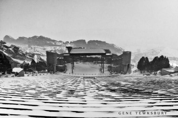
Existing strong dark and light tones make this photo an easy candidate for a monochrome photo.
Now every scene is not as simple as that. If I’m shooting a valley in the rocky mountains there is a good chance that most of the objects in my scene (trees, grasses, etc.) are all in the same tonal range AND none of those tones are nice and dark (our blacks) or very bright (our whites). They will tend to blend together in mid-tone greys which doesn’t separate the objects in the scene very well. Does this mean it cannot be a great monochrome image? Not necessarily but it does make it harder than a scene where nature provides the contrast for you.
Why shoot in black in white (monochrome)?
Separation/Contrast: What makes black and white photography so cool to look at (well, one of the things), is how we can emphasis subjects by separating them using strong contrast (darks and highlights). We can achieve this through various dodge & burn techniques. Strong contrast like this is difficult to achieve in color because as you tweak the contrast you make the colors break down into unnatural looking states of over/under saturation, additionally sometimes hues will shift as well. Not an issue in black and white. If I have a building which is a bland neutral tone (beige let’s say) and a bland mid-tone sky (overcast mid-day), they are going to tend to blend together in a color photograph. There will be little separation between the two subjects. Even once we take a black and white photo we will have a similar issue as both the gray sky and the beige building have similar tones. However, in black and white we can easily change the tone of the beige in post production to a much brighter value, even moving it into the bright whites range. Now the building stands out bright and white against the now, much darker sky. This would have a very unnatural look in color, but in monochrome it looks just lovely.
Skies/Structure:Using similar concepts as discussed above we can begin to make our skies far more dramatic in monochrome than we often can in color. Why? Because we have the ability in monochrome to really separate tones that are naturally very close to one another giving them greater contrast and structure. Can we do that in color? Yes, but again we end up with something that does not look natural. Example: When viewing an overcast/stormy sky everything is basically grey. In color this makes for a boring sky with little separation of the actual clouds. No strong differentiation between the lumpy clouds and the stretched clouds caused by the winds and the “foggy” clouds that are more cotton-like. Take the same photograph in black and white and we can now apply strong contrast and structure to the sky, breaking those close tonal values into separate shapes and yet it still looks natural. Why? well I see it this way. Black and white is UNnatural to begin with. It is the original photo “filter” and since it is already an unnatural / manipulated view of the world we do not react negatively to having unnaturally strong contrast or structure to the image.
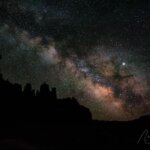
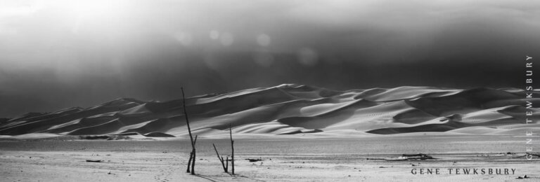
This image has great composition but in color it simply does not have enough contrast a structure to exaggerate the shapes. Doing so in post would look unnatural and unattractive.
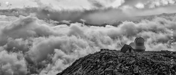
Monochrome has allowed me to “amp up” the contrast within the clouds and rocks. This much contrast in the color photo would have looked very unrealistic and unattractive.
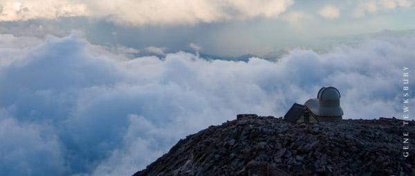
Even without post work the natural contrast in tone between the “bright” clouds and the “dark” rocks and building make for a better photo in monochrome.
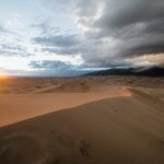
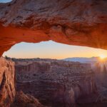
Color Can Distract: As noted earlier, our brains are hardwired to react to color. As such we tend to be easily distracted by colors. Often this can take attention away from our subject and/or composition. For instance let’s say we were photographing some amazing rock formations in Moab. Our subject is of course the amazing shapes and structures of the rocks themselves, but in the lower corner of the image is a strong green bush with green grass along the bottom of the frame (we wanted some foreground for depth). Now the greens are naturally going to draw our eye away from the arch of dark red/brown rocks which happen to be our subject. In a color photograph our eyes fight between two points of focus because the colored bushes act as a distraction from the subject. We are drawn to these bushes even though they are not the subject. In monochrome photography, the color is gone and our eyes default toward contrast, shape and form. Now it much easier for use to guide the viewer into our photograph in whatever way we see fit.
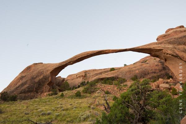
The featureless sky in this color photo makes the photograph look weak from the start. Additionally the green of the bush and grass is actually a stronger pull for our eye than the brown-ish rock (our actual subject).
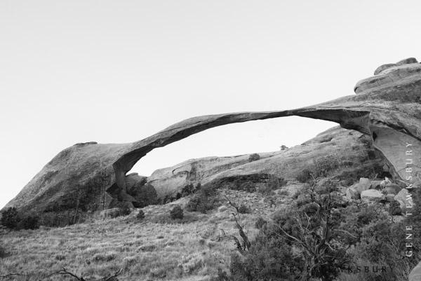
In monochrome our featureless sky looks just fine and actually allows us to further separate the tones of the sky from the rock (pushing the sky toward white and the rock toward blacks). This increased contrast helps to draw our eye to the arch.
In addition the greens no longer stand out in any significant way, thus helping to keep our eyes on the subject.
Helps with Poor Lighting: Let me start by saying you don’t want to get in a habit of trying to use black and white as a way to “fix” bad landscape photos (bad due to poor lighting / dynamic range). Chances are if you are doing this then you were never thinking about the shot as a monochrome in the first place, and thus it’s not likely to be composed in a manner most suitable for a black and white image.
Anyway, to the point. Color imagery can sometimes look pretty bland and boring in flat light (unless there is a lot of color in the scene / think fall colors). Black and white photography allows us to use contrast instead of color as our main draw for the eye and as such we tend to make more dramatic images in flat light.
Contrasty Light / High Dynamic Range is another major issue we face when shooting color. Under and overexposed areas will quickly ruin a photograph in color. A pure white sky with no detail in color pretty much ruins your photography, often not the case in monochrome. Black and white tends to be more forgiving, again because it is already an unnatural view of the world which lends itself better to the high contrast of a contrasty situation (think mid-day sun).
Reminder – You don’t want to pretend that black and white is some sort of “fix” for bad lighting. Just keep in mind that it is better suited to shooting in less than optimal conditions.
Nostalgia/Romance: Once upon a time there was only black and white, but now we generally see visual media in color. As such people often think of black and white as something wrapped in nostalgia and romance. A look from a “simpler time” or a more “pure” creative medium. Of course that’s all subjective. Times were complicated then too and in no world is black and white more “pure” than color. As noted already, we do not see the world in black and white. It’s a modified / manipulated art form from the start. It is “un-pure” from the start.
Filters:
- Circular Polarizer Filter: Generally this filter is used to reduce glare or reflection in an image. In black and white photography it is often used to help darken the sky and/or water by adding contrast. This often adds drama to the image. In reality this is no different than how it is used in color photography except that the resulting look is more dramatic.
- Graduated Neutral Density Filter: (GND) This filter is used to darken skies without affecting the photo below the horizon. These filters, as the name implies, are graduated such that the top of the filter is darkest and gradually clears until half way down the filter where there is no neutral density at all. The filter can be raised and lowered within a slotted attachment on the end of your lens allowing you to fine tune the horizon point.
HDR: This is not a filter but a process which helps in similar ways.If you don’t have the filter tools available to get your details the way you want, you might consider shooting the scene in multiple exposures and then creating a black and white HDR image. I personally think HDR images are much more viable options for black and white than color. The most common “giveaway” or artifact in HDR photography is unrealistic colors which make the photo look “fake” or over processed. Not an issue in black and white. In the photo below taken on Boreas Pass in Colorado the sun was very harsh creating great dynamic range problems. The sky and clouds were blazing bright while the valley was very dark. A GND filter would not work as it would darken parts of the mountain and trees as well. A polarizer would not solve the issue as it would have darkened the entire photo equally. The only solution was multiple exposures (HDR) to bring out all the detail of the trees, mountain and clouds.

HDR in monochrome does not suffer from color saturation issues nor hue shift.
Software:
In this tutorial I will not be going into details about how to do your post production in black and white, but I will make some brief comments on the software you can use.
- Photoshop – [Visit Website] We all know it, we all love it and it can do some decent black and white. In fact amazing black and white if you have the skill set to truly manipulate your image. Most people do not know PS well enough to do much more than hit the b/w button and move a few color sliders (which manipulate the tones of specific color ranges). This can produce great results, but there are better options.
- Lightroom – [Visit Website] Basically the same options as PS if you don’t have higher end PS skills. If you have good Photoshop skills then you can accomplish much more within that program.
- OnOne Black & White – [Visit Website] Now we are talking about a dedicated monochrome software. Its sole purpose is to manipulate black and white imagery. It has tools and features that allow you to expand your black and white creativity beyond anything you might have thought possible. And its dead easy to learn. Available as a PS or LR plugin.
- Nik Silver Efex 2 – [Visit Website] Very similar to OnOne Black and white. They share most of the same tools and features, but differ in certain areas. In particular the way in which they allow you to do selective area manipulation. I personally prefer Silver Efex 2 but enjoy OnOne as well. They are both great and you can’t go wrong with either software. Available as a PS or LR plugin.
#blackandwhitephotography #blackandwhitelandscapes #photographytraining #photographytutorial
- Interested in practicing these techniques in the field with an instructor?
- Check out these photography tours and workshops